Build an Accessible JavaFX Application
With the JavaFX Accessibility API fundamentals covered, this tutorial will guide you how to implement those concepts in a simple JavaFX application. The application is a form-based JavaFX system with the following functionality:
- Users can enter a name and adjust a slider.
- For better visibility, users can toggle high contrast mode.
- A preview panel visually reflects opacity set via a slider value.
- A "Save" action updates a status message.
- All elements are accessible via keyboard and screen readers.
Prerequisites
Before building the example, make sure your environment matches the assumptions used throughout this guide.
Use JDK 21 or newer (the snippets of this article use Java 26 syntax and JavaFX 26 namespace values), and make sure you have access to JavaFX SDK lib directory that contains the runtime modular JARs (javafx.base, javafx.graphics, javafx.controls, javafx.fxml).
NOTE: Java and JavaFX versions must align. Mixing major versions is a common source of startup and module-resolution issues.
Because the functional requirements span different layers of the application, the implementation follows a modular JavaFX design:
- Define explicit dependencies (
javafx.controls,javafx.fxml) inmodule-info.javaand open the controller package for FXML. This approach supports application security, maintainability, and scalability as the system evolves. - All visual styling is present in CSS files (
base.css,high-contrast.css), separately from logic, making it easy to switch themes (e.g., high contrast). - The FXML
accessible-view.fxmlfile is responsible for holding user interface structure declaratively, including layout and label associations. - Handle startup, loading FXML, attaching CSS, and setting the scene in the
AccessibleFxApplicationclass that extendsjavafx.application.Application. - The controller
AccessibleFxControllercontains all behavior and accessibility logic (keyboard handling, accessible roles, high contrast toggle).
Define the User Interface Declaratively
A good accessible user interface design starts by separating layout from behavior.
For that reason, the JavaFX application example in this guide has its layout in accessible-view.fxml that looks like the snippet below.
The layout is split into two areas: a form section for input and a preview section for output. This mirrors how users interact with the application and keeps the scene graph easy to understand.
Related elements are nested in VBox and HBox containers, and every input has a visible label.
The labelFor associations connect the meaning of the label to the accessible name of the control.
Screen readers will announce the label together with the associated control (for example, for a text field or a slider).
Design for Visual Accessibility
Once you define the interface structure, the next concern to address is presentation. Accessibility often requires alternative visual representations, but those variations should not complicate application logic.
For that reason, visual styling is externalized into a base stylesheet (base.css) like the one below.
Separating the default style into a dedicated stylesheet serves two purposes. First, it keeps presentation concerns out of the controller and out of the FXML layout. Second, it establishes a clean baseline that can later be overridden when accessibility modes are needed.
Wire Up the Application Entry Point
With the structure and styling in place, the next step is to connect those pieces into a working application.
That task belongs in the application entry point (AccessibleFxApplication.java), whose responsibility is to load the FXML, apply the base stylesheet, initialize the scene, and expose the scene to the controller.
As the application grows, it is also better to declare dependencies explicitly in a module descriptor (module-info.java).
Although this does not directly affect accessibility, it reinforces architectural boundaries and ensures that FXML loading and controller access behave predictably at runtime:
requires javafx.controls;gives access to standard UI controls.requires javafx.fxml;enables FXML loading.opens ... to javafx.fxml;allows the FXML loader to access controller fields and methods.exports ...;exposes the application package.
Add Labels and Accessible Help
Up to this point, the application development has focused on structure and presentation. The next step is to introduce behavior via AccessibleFxController.java.
In a JavaFX application, the controller is the place that handles user interactions, coordinates dynamic behavior for the user interface components and applies accessibility metadata to them.
For example, inside AccessibleFxController.java you can assign contextual help, accessible text, and tooltips as shown below.
The user interface offers guidance through both visual and non-visual channels, but it does so in ways appropriate to each interaction model. Tooltips are useful for pointer-based interaction, particularly for users who rely on the mouse or want quick visual hints.
accessibleHelp, on the other hand, provides extra context to assistive technologies such as screen readers. Keeping these definitions close together in the controller makes it easier to ensure that both forms of guidance stay aligned.
Make Non-Standard Nodes Accessible
At this point, the standard controls already carry much of their accessibility behavior automatically, because JavaFX assigns appropriate roles to built-in controls such as buttons, sliders, and text fields.
But custom nodes (like Rectangle) still lack semantic meaning.
Visually, the user can infer that it reflects the slider value. A screen reader, however, sees only a shape unless semantics are added.
To address that, the controller assigns an appropriate role and descriptive metadata:
Each property contributes a different aspect of meaning. The accessible role tells assistive technology what kind of component the node should be treated as.
The role description refines that classification when the generic role alone is too broad. The accessible text communicates what the element represents, and the accessible help provides additional explanation.
Finally, setFocusTraversable(true) ensures the node can participate in keyboard navigation if it is intended to be interactive.
Add Keyboard Navigation and Shortcuts
Once semantics have been assigned, interaction must be made equally accessible. Keyboard support is essential not only for users with motor impairments, but also for users of screen readers, who often rely on keyboard-based navigation patterns. For that reason, the application needs to provide both standard accelerators and meaningful keyboard access to custom interactive elements.
In this example, the controller AccessibleFxController.java addresses both concerns. It registers Ctrl+S as an accelerator for the save action, and it attaches keyboard handling to previewRectangle:
The built-in controls already participate in normal focus traversal and keyboard interaction, so no extra work is needed there. The preview rectangle, however, is not a control, so it requires both focus traversal support and a key handler. This is a good example of a broader rule in JavaFX accessibility: custom nodes do not inherit meaningful interaction behavior automatically, so if they matter to the user, that behavior has to be added intentionally.
Implement High-Contrast Toggle Behavior
Many users with visual impairments prefer high contrast mode because it increases the contrast between foreground and background colors, making text and user interface elements easier to distinguish.
The simplest implementation is to keep your normal stylesheet for the default appearance, then add a second high-contrast stylesheet (high-contrast.css) that overrides those styles when the user enables the mode.
Once you defined the high-contrast stylesheet as a separate visual layer, the next step is to make that capability available to the user at runtime. This happens in the controller, where the checkbox state is observed and used to add or remove the high-contrast stylesheet from the scene.
The controller does not know anything about individual color values or style rules. It simply reacts to user intent and switches the relevant stylesheet on or off. That keeps the controller focused on behavior while allowing CSS to remain the single source of truth for visual appearance.
Bind Opacity and Expose Status Updates
The last piece is to connect the visible behavior of the preview to the slider and to ensure that status updates remain accessible. The slider should update the opacity of the preview in real time, and user actions (such as Save or keyboard activation) should be reflected in the status label.
Binding the slider to the preview ensures immediate visual feedback: the preview’s opacity is derived from the slider’s numeric value. Updating accessibleText alongside visible changes ensures that assistive technologies receive the same information.
Putting All the Pieces Together
At this stage, all parts of the application are connected:
- the FXML defines the structure of the interface,
- CSS defines the default and high-contrast visual states,
AccessibleFxApplicationis responsible for bootstrapping the scene,- and
AccessibleFxControllercentralizes behavior and accessibility logic.
What matters most here is not the size of the example, but the consistency of the design. The package name, the fx:controller declaration, and the resource paths all need to match the same org.example.accessibility structure, otherwise resource loading will fail at runtime.
Once those conventions are aligned, extending the project becomes much easier because every new feature follows the same pattern: declare the structure in FXML, define presentation in CSS, and attach behavior in the controller.
The code inside AccessibleFxController should therefore look like the snippet below.
And you can run the entire setup with the following command:
NOTE: When composing module-path values in commands, remember that the path separator differs by operating system: use : on macOS/Linux and ; on Windows.
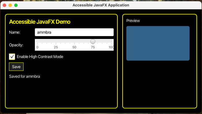
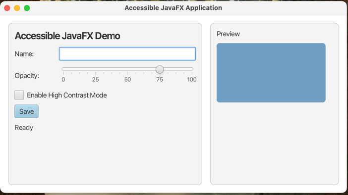
The application should open in its default theme, support keyboard interaction, and allow switching to high contrast at runtime.
Final Tips
A modular JavaFX structure that combines FXML (layout), CSS (styling), and a controller (behavior + accessibility metadata) keeps concerns separated and makes accessibility improvements easier to implement and maintain as the user interface evolves. To carry that approach through your application, keep these tips in mind:
- Use visible labels and connect them to inputs (via
labelFor) so assistive technologies announce the right context. - Add accessibility metadata (role, description, text, help) when built-in controls do not provide enough semantics, especially for custom nodes.
- Ensure that all the interactive elements are keyboard reachable (
setFocusTraversable(true)) and behave predictably with standard keys. - Provide keyboard shortcuts for common actions (for example,
Ctrl+Sfor saving) to support efficient keyboard-only workflows. - Offer a high-contrast option by switching stylesheets at runtime rather than mixing theme logic into user interface code.
- When the user interface state changes (like status updates), reflect it both visually and in the accessible text so the screen reader output stays accurate.
Before wrapping up, do a quick pass to confirm the essentials are covered: favor built-in JavaFX controls where they fit, test that the full user interface is usable with keyboard-only navigation, make sure any custom components expose clear text and help, and ensure state and meaning are communicated in more than one way (not just visually).
Last update: March 25, 2026